Would A Call Center Help Your Multi-location Business Close More Deals?
John Goddard, a recent guest on our podcast, spoke of a hypothetical business with 50 locations, customers sending leads to each individual...

 Does your content ask people for the sale? Does it ask for it early and often? Does it extend the proverbial hand to close the deal when complete? Unfortunately, I see ample examples of marketing and informational content that does a poor job of incorporating CTAs (calls to actions).
Now please don’t misunderstand, I am not saying that your content should read like a late-night infomercial or leave the reader feeling like they just went 3 rounds with a slick used-car salesman, but even the low pressure and informational content typical of content marketing, inbound marketing, or earned media strategies, should end with a recommended action. Think of CTAs as leading readers along a path to the next logical step that assists them – and potentially rewards you.
We can accomplish this by placing CTAs strategically throughout the main body of our content or in close proximity to it, thus minimizing the obvious step of navigating away from or closing your site.
What your call to action should be is dependent on many factors, including the type of site you run, the type of content it has – informational, transactional, entertainment, etc. – and of course, your sales path, conversion funnel, and content marketing strategy.
Let’s look at a few CTAs you could be using, keeping in mind that there are many variants and modifiers. I’m also not going to get into CRO (conversion rate optimization). For now, I would be happy if you try incorporating any of the appropriate examples below:
Comment below. If you’re trying to start a relationship with the reader, get feedback, and encourage engagement, or if other CTAs are not appropriate for the page you are on, this may be ticket.
Share now. Follow us. Like us. Refer a friend.These are gimmes. Seriously, there are few reasons why these shouldn’t be on the page. That said, make sure that these are not more prominent than a more desirable action.Mashableis clear and conspicuous about their desire for shares.
Related content. Read more. Learn more. Click here. Take the tour. View plans and pricing. View our portfolio. These may appear throughout the content, though likely separated slightly, or at the end and should further engage the reader or move him down the sales path or conversion funnel. For example, you might use “take the tour” in a sentence early in the content, then use a graphical element with the words “take the tour” in it at the end of the article. I’m being lazy and using our own MarketSnare example here.

Download our whitepaper. View our case study. Download our free tool. Get our free ebook. These are very similar to “related content” but may be valuable enough resources to be presented as gated content, which may also place the reader into a lead-nurturing or lead-scoring system.
Find a location. Visit our showroom. These are direct, but if they are appropriate for your business type, I would normally show these consistently at all stages and on most types of content.
Sign up. Create an account. Try it. Join our newsletter. While you are not asking for an order or money, you are asking for personal information or at least for a bit more of the readers time and effort in filling out some fields. Simplicity is often the best route, as we can see in theBeta List CTA below.
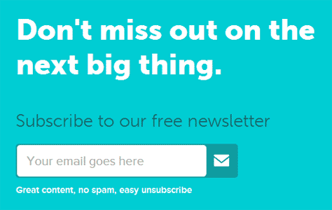
Request a quote. Download a trial. Free 15 day trial. Download our app. Schedule a demo. Contact us. These are more direct CTAs that can be presented consistently through the sales path, but should receive higher priority on pages where conversion is more likely to occur. In short, use a CTA that will get readers to convert or get them to another page that will.
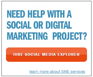
Get tickets. Book now. Schedule an appointment. Get started now. Donate now. Buy now. Upgrade now. These build urgency with the use of “now” and obviously go straight for the jugular. They should be used appropriately and after you’ve made your best case.Social Media Explorer is certainly pretty clear and direct.
Look, you have readers right there, on your page. And to be frank, depending on what lured them in, they may not be coming back. So make the effort right now to demonstrate that you have the ability to solve their problems and answer their questions. And if you can, endear them to you, your product, or service.
 Far too often I see pages with content that just stops. Abruptly. Yeah, I know, you might have something in the footer or sidebar, but what do you have after the last word – you know, where they are looking? Social icons? That’s great if social sharing or follow requests are really the most important action for visitors to take. If not, make sure social CTAs supplement calls to action that have more value.
Instead of leaving the next step up to the readers’ whim, why not try to influence their actions? In other words, let’s try to stop the obvious action, which, again, is for them to navigate away from your site or to close it. Get started using the CTAs appropriate for your site and content, graphically or textually, today. Later, we can measure the impact and potentially do some A/B testing to see which CTAs are providing value. But that is for another day.

John Goddard, a recent guest on our podcast, spoke of a hypothetical business with 50 locations, customers sending leads to each individual...

I’m sure you know the following quote by John Wanaker: “I know that half the money I spend on advertising is wasted. The trouble is, I don't know...
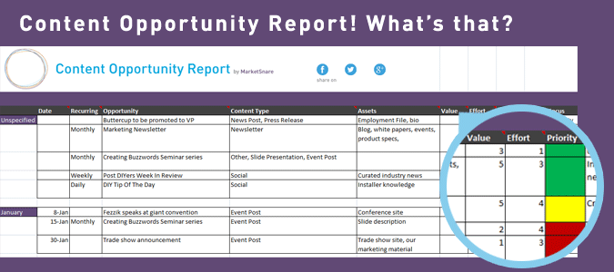
Over the past several years much has been said and written on the subject of editorial calendars. But few people have specifically addressed...